游戏号头像
尺 寸:不低于 200 x 200 像素
格 式:JPG
数 量:至少 1 张

WeGame 设计中心官方站点
游戏号头像
尺 寸:不低于 200 x 200 像素
格 式:JPG
数 量:至少 1 张

其他商标
尺 寸:不低于 500 x 500 像素
格 式:PSD(分层)/ PNG(透明背景)
数 量:至少 1 个

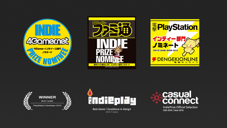
获奖信息
尺 寸:宽度固定 240 像素,高度不限
格 式:PNG
数 量:非必须
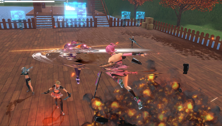
游戏截图
尺 寸:不低于 1920 x 1080 像素
格 式:JPG / PNG(透明背景)
数 量:至少 5 张
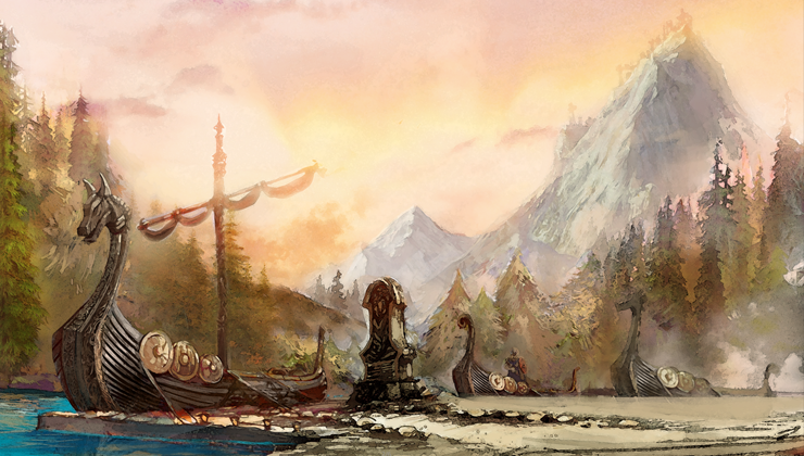
游戏场景
尺 寸:不低于 1920 x 1080 像素
格 式:PSD(分层)/ JPG
数 量:至少 5 张
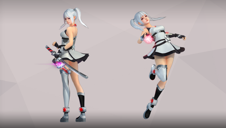
角色&道具
尺 寸:不低于 1000 x 1000 像素
格 式:PSD(分层)/ PNG(透明背景)
数 量:至少 5 张
宣传资源
尺 寸:不低于1920 x 1080 像素
格 式:PSD (分层)
数 量:至少 2 张
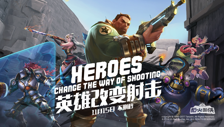
桌面图标
尺 寸:不低于 500 x 500 像素
格 式:PSD(分层)+ PNG
数 量:至少 1 个
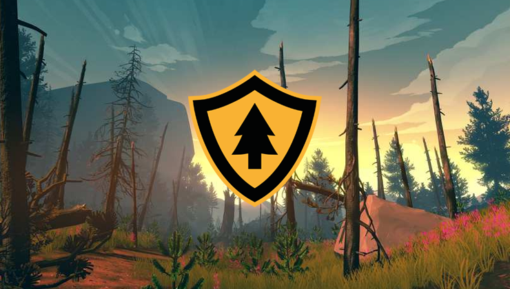
游戏商标
尺 寸:不低于 1000 x 1000 像素
格 式:PSD(分层)
数 量:至少 1 张

主视觉图
要 求:不低于 1920 x 1080 像素
格 式:PSD(分层)
数 量:至少 1 张
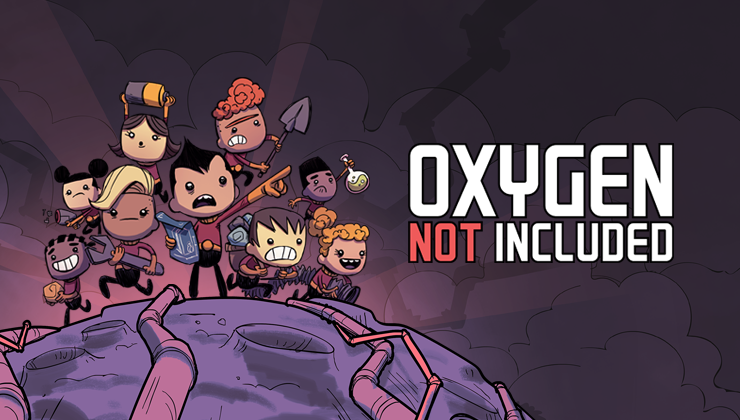
Game Logo of Game Channel
Size: 110 × 60
Format: PNG
Quantity: 1
Template: Game-Logo-and-Background-of-Game-Channel.psd

Dedicated to highlighting your logo and make it stand out among various games.
To be displayed at the top left corner of game channel.
1.To guarantee optimal display effect, please use material from your game package or content for marketing, both of which should be consistent with key vision material.
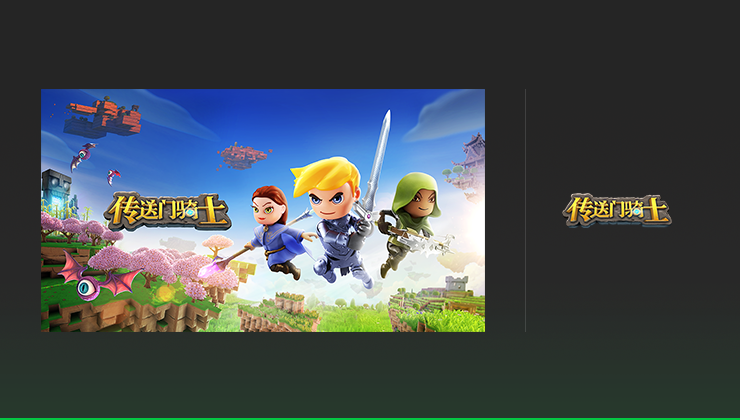
Correct
2.The logo background should be transparent.

Correct

Logo should not come with a background.
3.Logo is expected to be vertically centered in the image zone and zoomed in as great as possible.

Correct
Game trademark should not exceed the image zone. It is also expected to be zoomed in as great as possible.

Though logo is zoomed in as great as possible, it is still not vertically and horizontally centered.
4.In the real scenario, logo will be displayed at a light-colored background.It shall be easily distinct.

Correct

The color of game logo should not be too close to the light-colored background. The two are expected to be distinct.
Award Image
Size: The fixed width is 240 and the height can be set at any value.
Format: PNG
Quantity: One can be configured if needed.
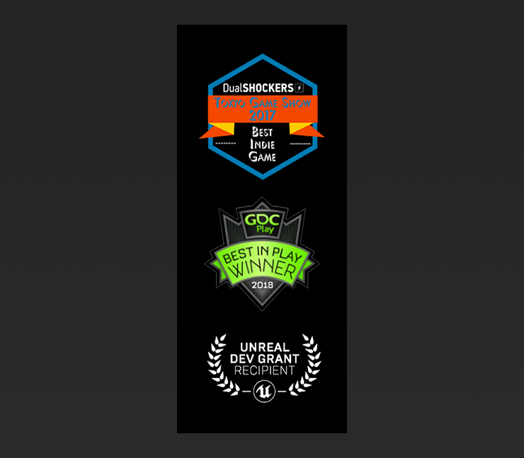
Dedicated to present the achievements and popularity of your game to the gamers.
To be displayed at Awards of detail page.
1.Each award should explicitly include the award-giving entity’s trademark/name as well as the name of this award.
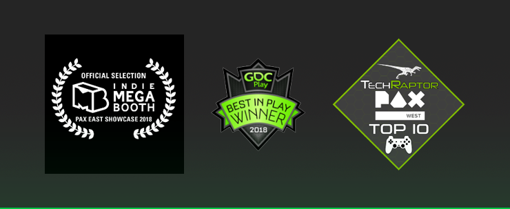
Correct

Award-giving entity’s trademark alone will not suffice.
2.Each award should be clearly visible at the background.
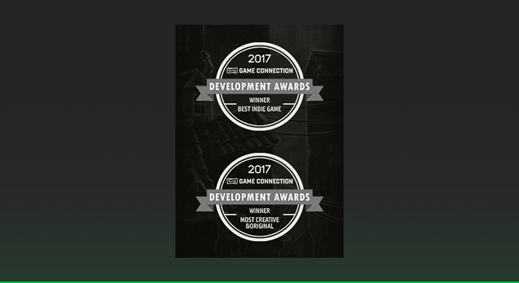
Correct
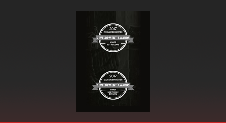
The award-related text should not be too small to be legible.
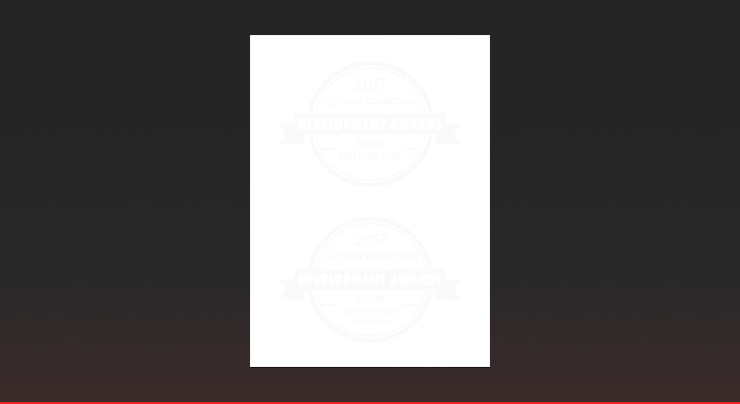
Award image should not be indistinct from the background.
Detailed Game Info Image of Detail Page
Size: 640 × 120 ~ 640 × 360
Format: PNG/GIF
Quantity: as many as needed
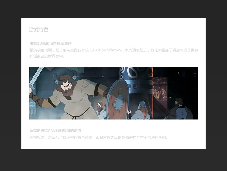
Dedicated to introducing your game in a more intuitive and vivid fashion.
To be displayed Detailed Game Info of detail page.
Screenshots
Size: 1920 × 1080
Format: JPG / PNG
Quantity: No less than 5
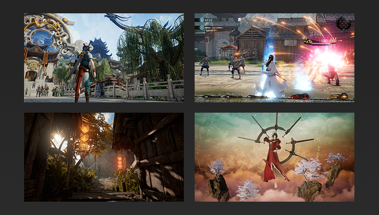
Dedicated to present the authentic gaming experience to all of the gamers.
To be displayed at the slide show of the first page among Detail Page.
1.Screenshots are able to present gaming experience of all facets including game genre and core gameplay. To achieve optimal display effect, please provide high-resolution screenshots with the width-height ratio as 16:9.
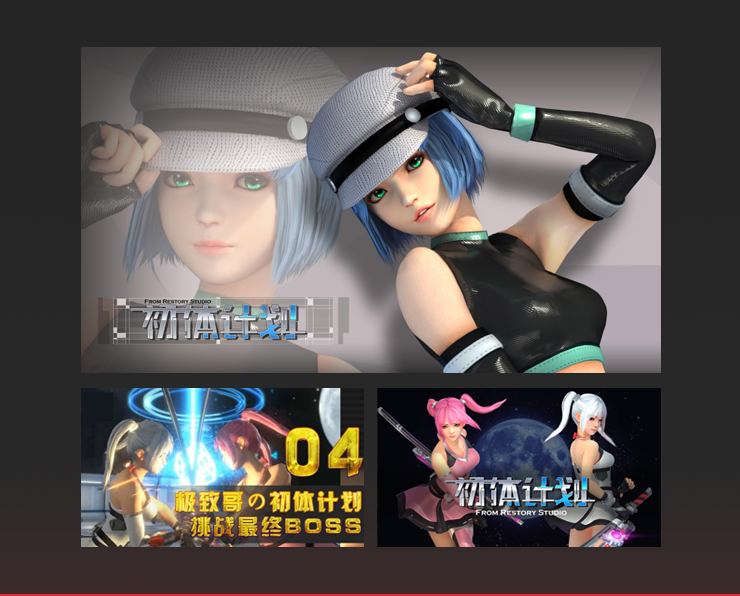
• Please avoid any concept art, still frame images from prerendering.
• The image should not include anything irrelevant content, for example marketing copy, awards and/or product descriptions.
The Header Image and Background of Detail Page
The Header Image of Detail PageSize: 1920 × 193
Format: JPG
Quantity: 1
Background of Detail PageSize: 1920 × 940
Format: JPG
Quantity: 1
Template: The-Header-Image-and-Background-of-Detail-Page.psd
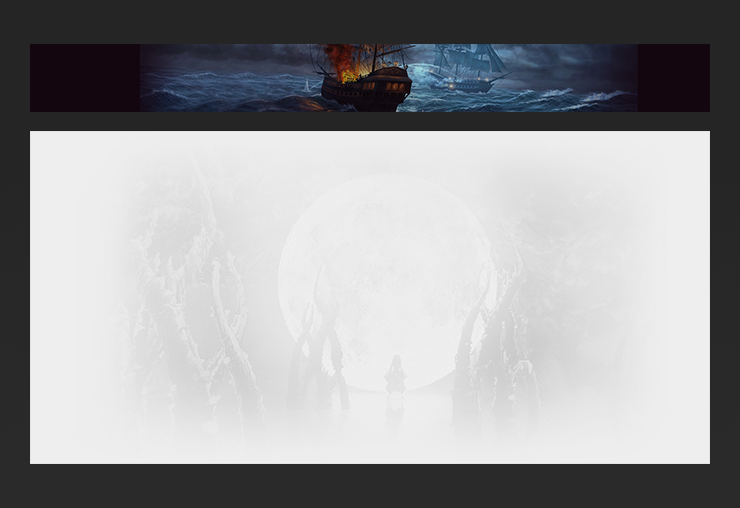
Dedicated to decorating and enlivening pages. The style and flavor of your game will also be passed on to the gamers.
To be respectively displayed at the top and background of Detail Page.
1.The background can not be too conspicuous in case it should compromise the legibility of the foreground content. Environment art or ambient art is recommended.
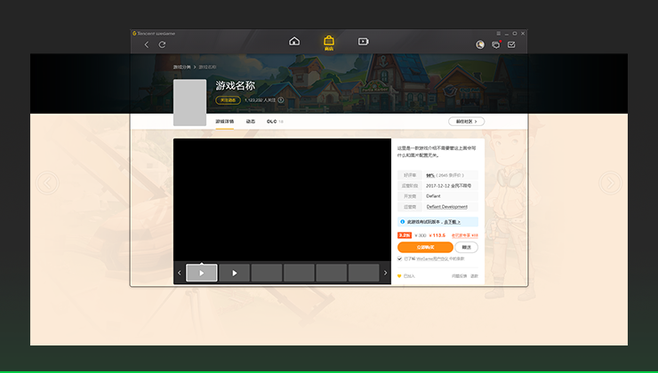
Correct
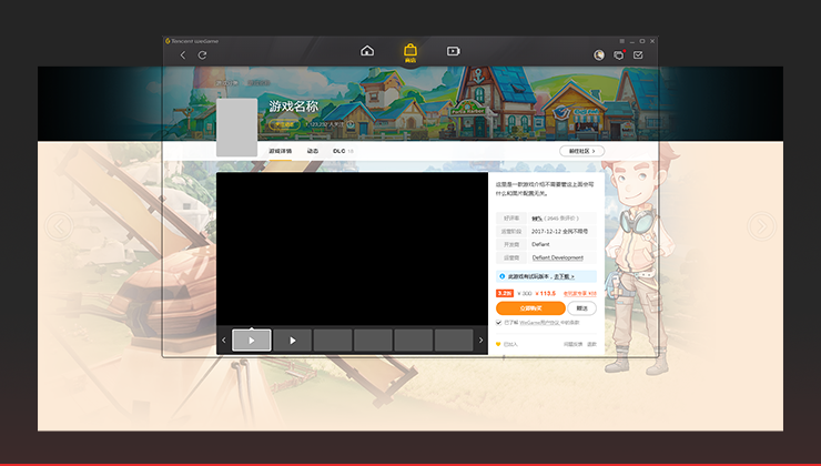
Image should not be too highlighted because it hinders the reading of foreground content.
2.The two sides of the top image gradually change into pure black and the edge of background into another pure color.
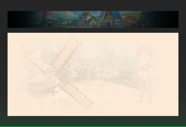
Correct
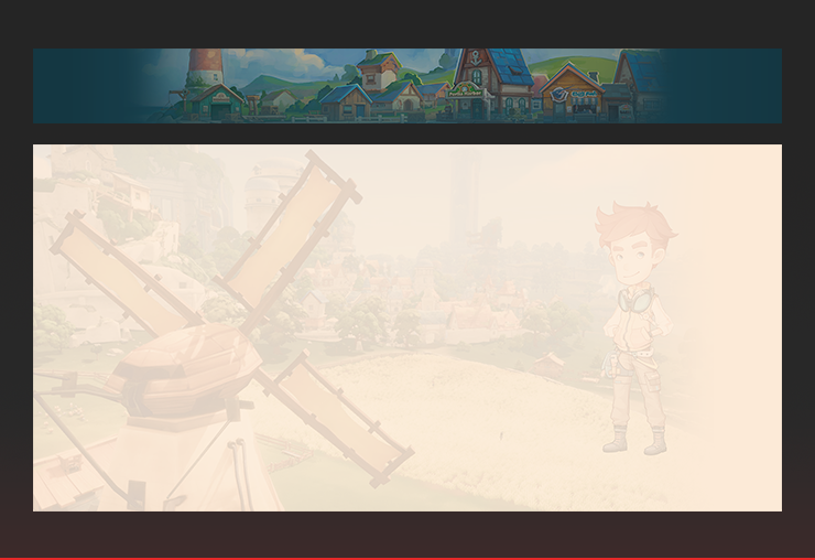
The two sides of the top image do not gradually change into pure black. The edge of background does not gradually change into a pure color.
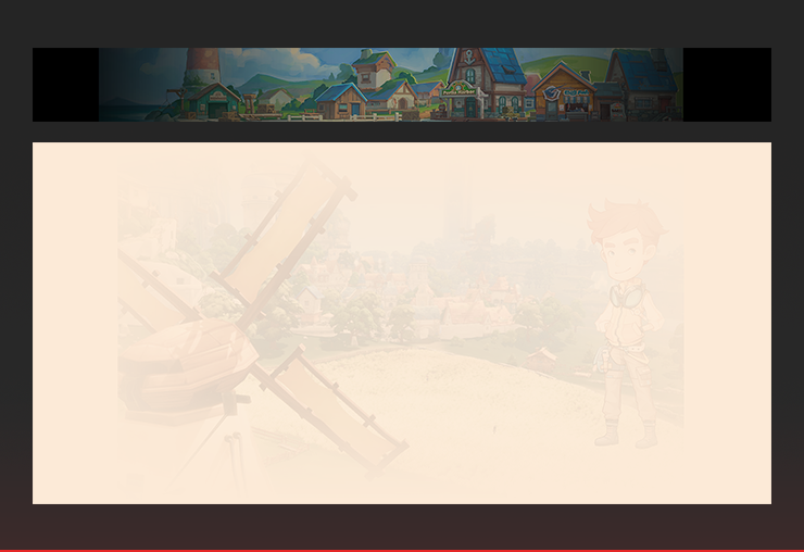
The gradience does not look natural and the image is torn apart by this fault.
Game Icon
Game Icon (large)Size: 128 × 128
Format: PNG
Quantity: 1
Game Icon (medium)Size: 64 × 64
Format: PNG
Quantity: 1
Game Icon (small)Size: 48 × 48
Format: PNG
Quantity: 1
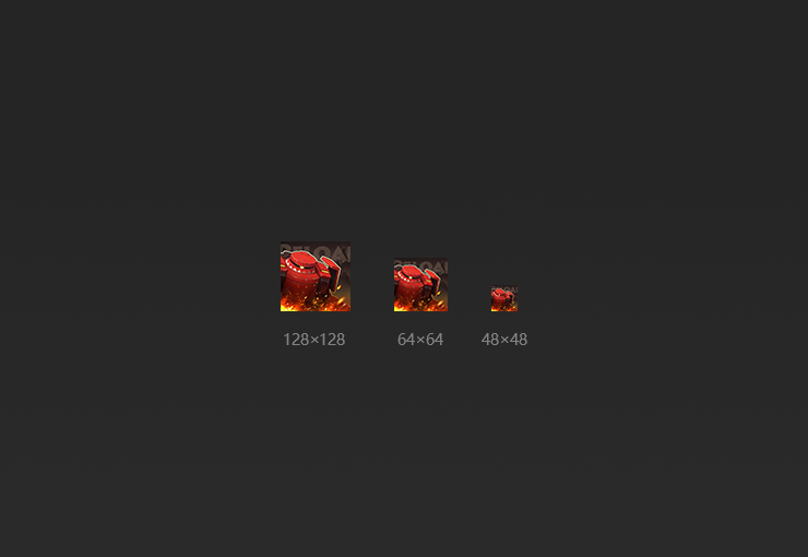
To help gamers quickly find your game among all the thumbnails.
Game Icons are displayed at Game list
1.Hollow icons or icons with transparent background should be avoided.

Correct

Icons should not be hollow. Background should not be transparent.
2.The same design is expected to be adopted by icons of all the three sizes.

Correct

Varied designs should not be adopted for icons of the three sizes.
3.Both the pattern and text should be legible in icons of all the three sizes
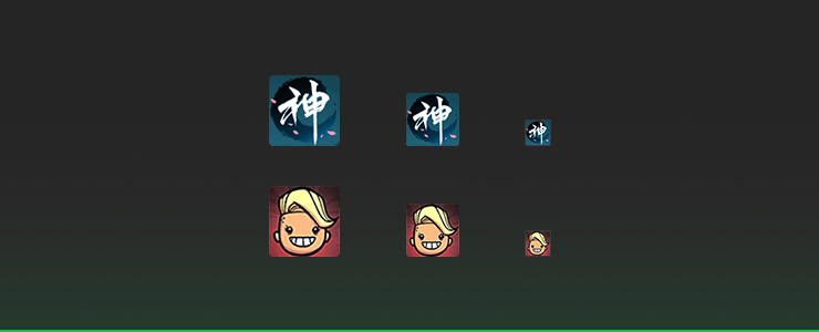
Correct
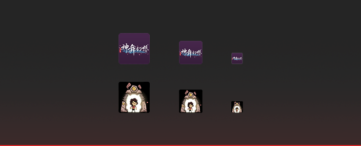
The pattern or text in the icons is illegible.
Vertical/Horizontal Poster
Vertical PosterSize: 300 × 430
Format: JPG
Quantity: 1
Template: Vertical-Poster.psd
Horizontal PosterSize: 540 × 302
Format: JPG
Quantity: 1
Template: Horizontal-Poster.psd
